Styling and Enhancing Model Driven Apps in Power Apps

I've recently been researching how to style Power Apps. This sent me off on a long Google search to find best practices from the community. I found some pretty interesting content from Iamcat to simplifying you power apps theme template with bulb digital - all really useful, but as with most fast moving products, many of the examples no longer worked (i.e. 'gbltheme' is no longer a valid syntax).
However, as our project progressed, we decided to go down the route of using a simple Model Driven App, which has a very different approach to styling or enhancing the branding compared to a Canvas Power App. This process is much more rigid in terms of what you can do with styles because you're in the low code/no code environment. Our initial outline had been styling fonts, spacing and layouts however, in this environment we can also apply a brandmark and apply a series of accent colours to brand the Power App.
So, in this post we're just going to take you through a step-by-step process for styling a Model Driven App - and it may seem a lot simpler than originally thought.
Accessing the Theme Environment
Once you're in an environment you'll need to select the 'Settings' cog in the top right of the screen then scroll down and select 'Advanced Settings'. This takes you into the "backend" of the settings - I had to clarify with a colleague whether I should be here because it felt like a strange experience, almost as if I shouldn't be here. But I carried on following the instructions.
Once you go through the settings experience your need to select the 'Setting' dropdown in the top left corner which reveals a sub menu. Select 'Customization' which will reveal a sub menu then select 'Themes'. The next screen you enter will show all the themes available within this environment. To set up a new theme we cloned an existing theme for simplicity, and it gave us a clear indication of the styles we could enhance.

Adding a New Brandmark Image
Before we got into the process of enhancing styles, we changed the name of our cloned theme. Then next up was applying an image or logo which will appear in the header. After further research we found the optimal size for this image needs to be 245px X 245px square. Depending on the shape of the brandmark you'll need to add some padding around all the edges of to your artwork so that it clears one of the accent lines.
Adding the image to the environment.
Select the mag glass into the right of the dropdown. Your image will not be in there so, you'll have select new to add your image. This will open a modal for adding a new Web resource. You'll need to add a name, display name, a brief description under the General tab this s o that you can find your image via the search.
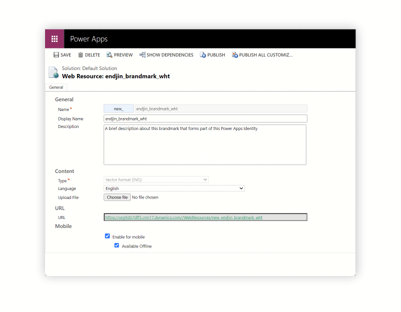
Under the content tab you'll need to add file type which allows you to select the format. We often select SVG where we can for maximum clarity. Language should be set to the primary language. Then navigate to your chosen file to upload. We then select mobile compatibility and select offline. At this point hit save then publish. This will publish your logo/brandmark to the environment and it will be come searchable. You can close this modal window and begin searching for your Brandmark to add to your theme. This oversized image shrinks and tightens up within the theme.

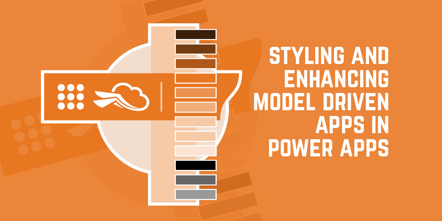
Revising the Colour Palette
Next, we start to add colours from our brand palette. We were using a monochromatic colour way with shades of one colour, but you can apply whatever colours you like in line with your accessibility guidelines. An interesting thing happens here because the first colour we entered for Navigation Bar Fill Colour also becomes the colour for the Title Text Colour, Link and Button Text Colour, and the Legacy Accent Colour. We then added our colours using our cloned style as a guide for the tone of colour we should be using. We changed 12 colours in total whilst retaining the greys at the bottom.
Design tip: If your Navigation Bar Fill Colour is a dark primary background colour then the Navigation Bar Shelf Fill Colour will need to be white as these effects the text colour. Obviously if the colour is lighter then you may need to use a darker Navigation Bar Shelf Fill Colour and always check for accessibility from a tonal aspect.

Final thoughts
As you will see we are enhancing an environment with subtle accents towards a company's brand. Styling a Model Driven App is not as extensive as styling a Canvas App. There are only certain elements you can access as its quite prescriptive, however as this article has shown, it is possible to make it look and feel like part of your company's brand.
We hope you've found this article useful.